Independent concept · Design-led branding · Home electronics

Technologyshould beseen.

Jupiter Co. — Founder & brand strategist
2026 · Independent, self-initiated concept · Brand strategy, identity & creative direction

Jupiter Co. is a self-initiated home electronics brand concept exploring how industrial design can make everyday technology worth displaying again. I built the positioning, visual identity, product design language, creative direction and website around four conceptual objects united by tactile controls and a distinct Space Age-inspired point of view.

4
Objects,
one design language
3
Rules every object
has to pass
0
Apps needed to use
any of them
40
Slides across strategy
and guidelines
Jupiter Co. wordmark with planetary symbol
Est. Tomorrow

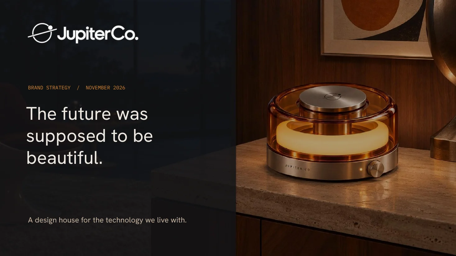
“The future was supposed to be beautiful.”

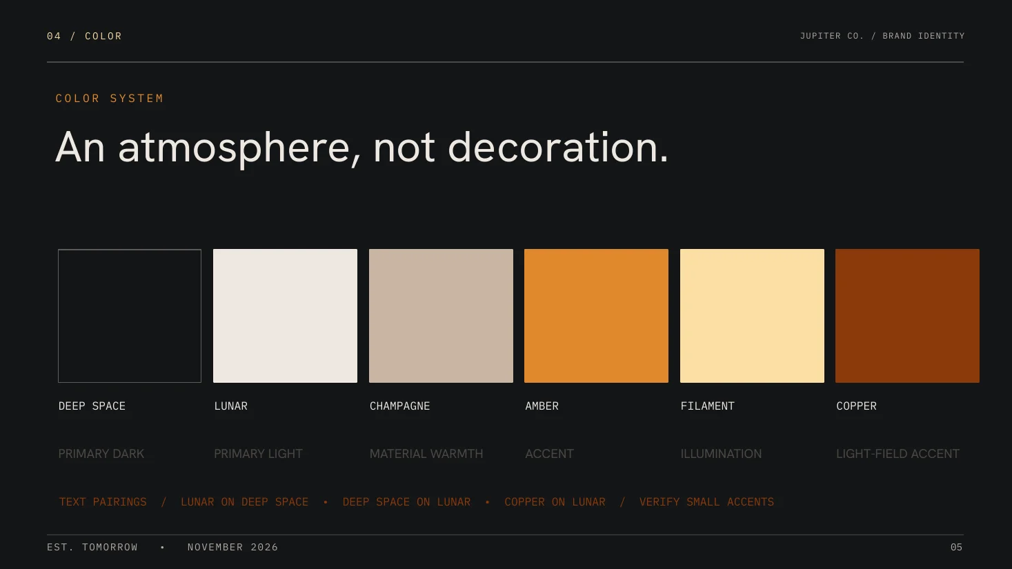
Deep Space#141518
Lunar#EDE8E1
Champagne#C9B6A3
Amber#E08A2C
Filament#FCDFA4
Copper#8A3A0A

The brief · A design-led home electronics brand

Jupiter Co. is a brand I created from scratch: a home-technology label for the lamp, the speaker, the clock and the charger, built on one belief, technology should be seen. It's a self-initiated concept, developed across two decks (brand strategy and brand guidelines) and a working brand site.

The problem I set myself was a brand problem. Everyday electronics keep gaining capability and losing character. Could a new name make the category worth looking at again, and hold one idea together across four very different objects?

The thesis · Brand positioning through industrial design

People already style their homes with care. Then the technology arrives in a black box, gets hidden in a cabinet, and asks for an app to do something a switch used to do.

Design useful electronics that people want to leave out.

That one choice sets the limits of the brand. Jupiter is a design house with no ecosystem to sell. Each object works on its own, every routine action has a physical control, and what the four share is a design language: warm metal, amber light and a control you can feel.

The work · Brand identity, product language & art direction

Category tension Where the opening is
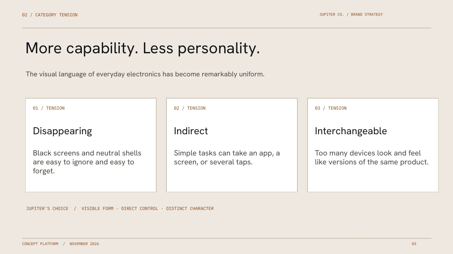
Read the visual sameness of everyday electronics as three tensions. Devices disappear into black screens and neutral shells. Simple tasks take an app or several taps. Products look like versions of each other. Each tension became a brand choice: visible form, direct control, distinct character.
Audience Two mindsets
The design-conscious curator plans rooms carefully and won't put an ugly device on a good shelf. The hands-on modernist would rather turn a dial than unlock a phone for a basic task. Both map to three reasons to choose Jupiter: functional, emotional and identity.
Positioning The open quadrant
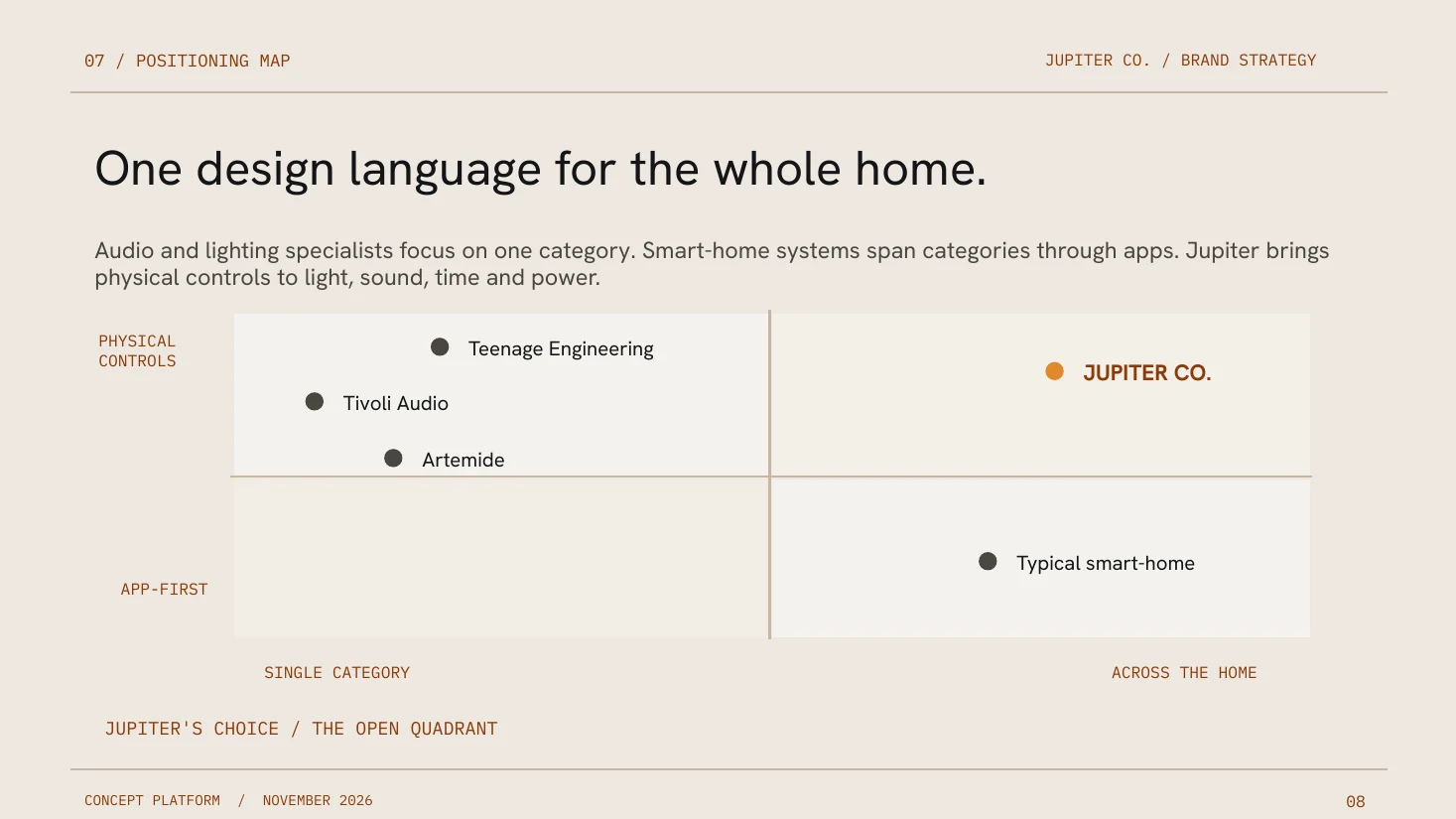
Mapped the reference set on two axes: app-first to physical controls, single category to across the home. Tivoli and Teenage Engineering own audio. Artemide owns lighting. Smart-home systems cover the home through apps. Physical control across light, sound, time and power was unclaimed, and it became the position.
Brand platform
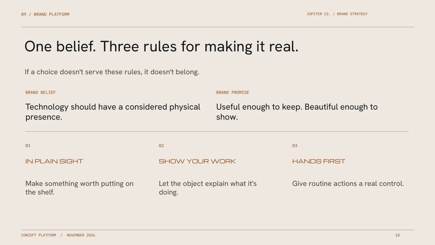
One belief: technology should have a considered physical presence. One promise: useful enough to keep, beautiful enough to show. Three rules every object has to pass: In Plain Sight, Show Your Work, Hands First.
Character & voice
Optimistic, confident, playful and precise, written like a design editor. “A real dial. No app required.” is on voice. “The ultimate smart-home revolution.” is the line the brand never writes.
Visual identity
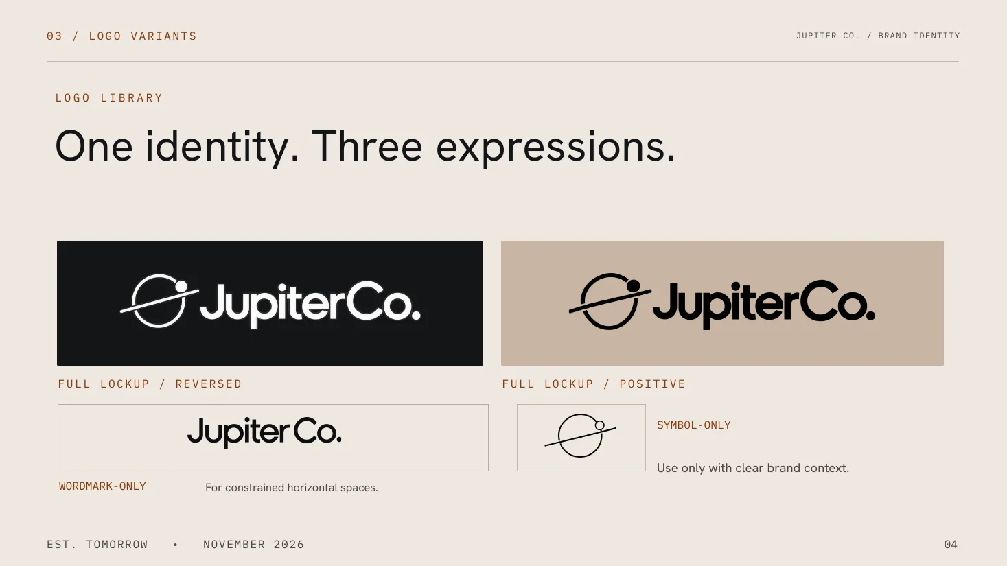
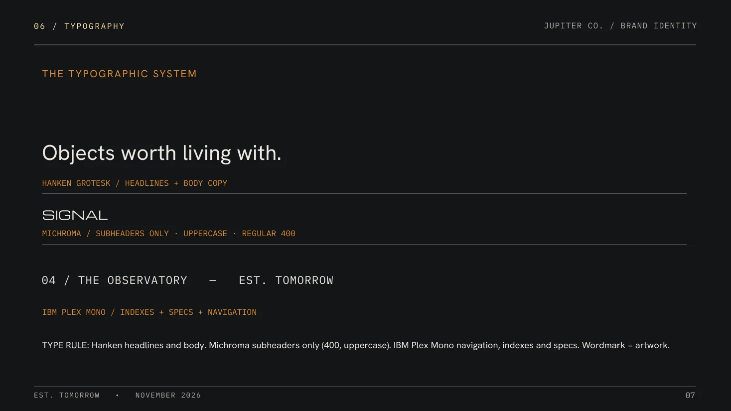
A planetary symbol and wordmark in three lockups. A six-color palette pulled from the products themselves, from Deep Space to Copper. Three typefaces with one job each: Hanken Grotesk for headlines and body, Michroma for uppercase subheads, IBM Plex Mono for specs and navigation.
Art direction Show the material
Brushed aluminum, amber acrylic and knurled controls rendered as they would really look, in warm rooms, with light that behaves like light. Three image types (architectural, material, collection) with fixed formats for hero, detail and product.
The collection
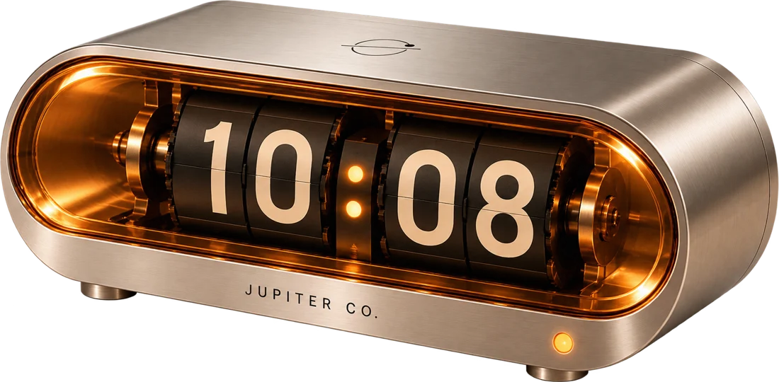
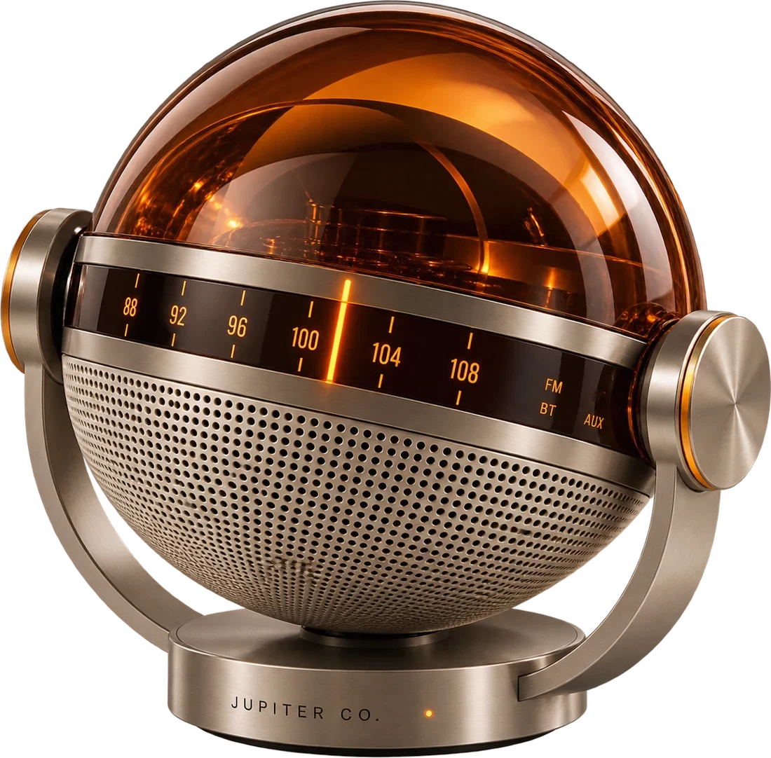
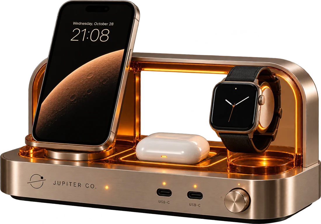
Four objects with a shared design code and different jobs: Flare for light, Signal for sound, Count for time, Dock for power. Single-word names that describe the job, so the brand carries the personality.
Guardrails & governance
Four rules to keep a strong idea from turning into a costume: no gimmicks, no invented capabilities, no invisible complexity, no fragmented language. The guidelines add a master-asset library, approvals and version control.
Website & editorial
A working brand site with the collection, product pages built around interactive demos (a dimmer you can drag, a tuner, a running flip clock, a night on the charger), material details and three Observatory essays written in the brand voice.
Selected artifacts — the collection

Four objects, one design code. Each covers one everyday job and works on its own.
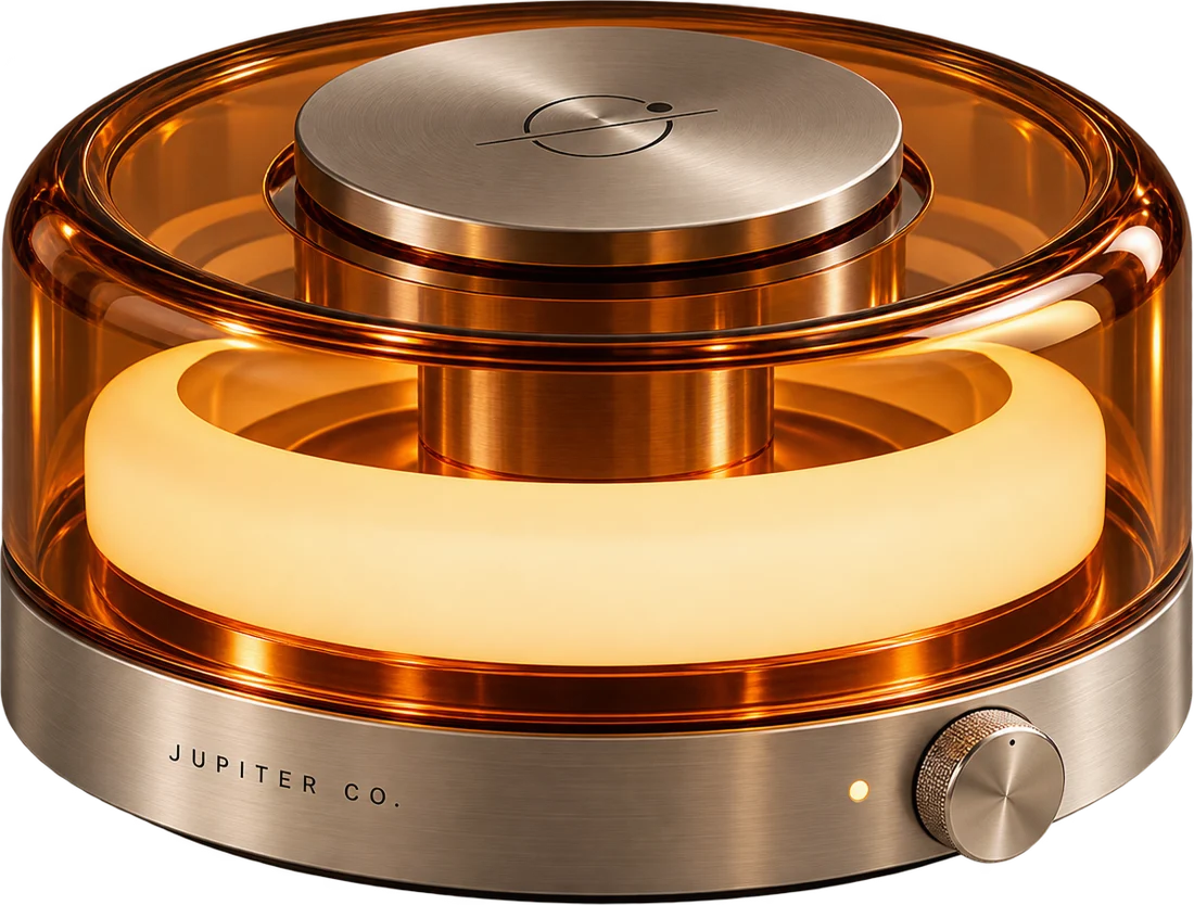
Flare ambient light: a glowing ring inside an amber acrylic shell on a brushed aluminum base
Flare — ambient light, dimmed by hand
Count flip clock in a brushed aluminum capsule with amber edge-lit digits
Count — flip clock, read from across the room
Signal spherical radio and speaker with an amber dome, tuning band and steel mesh grille
Signal — radio and speaker, tuned by hand
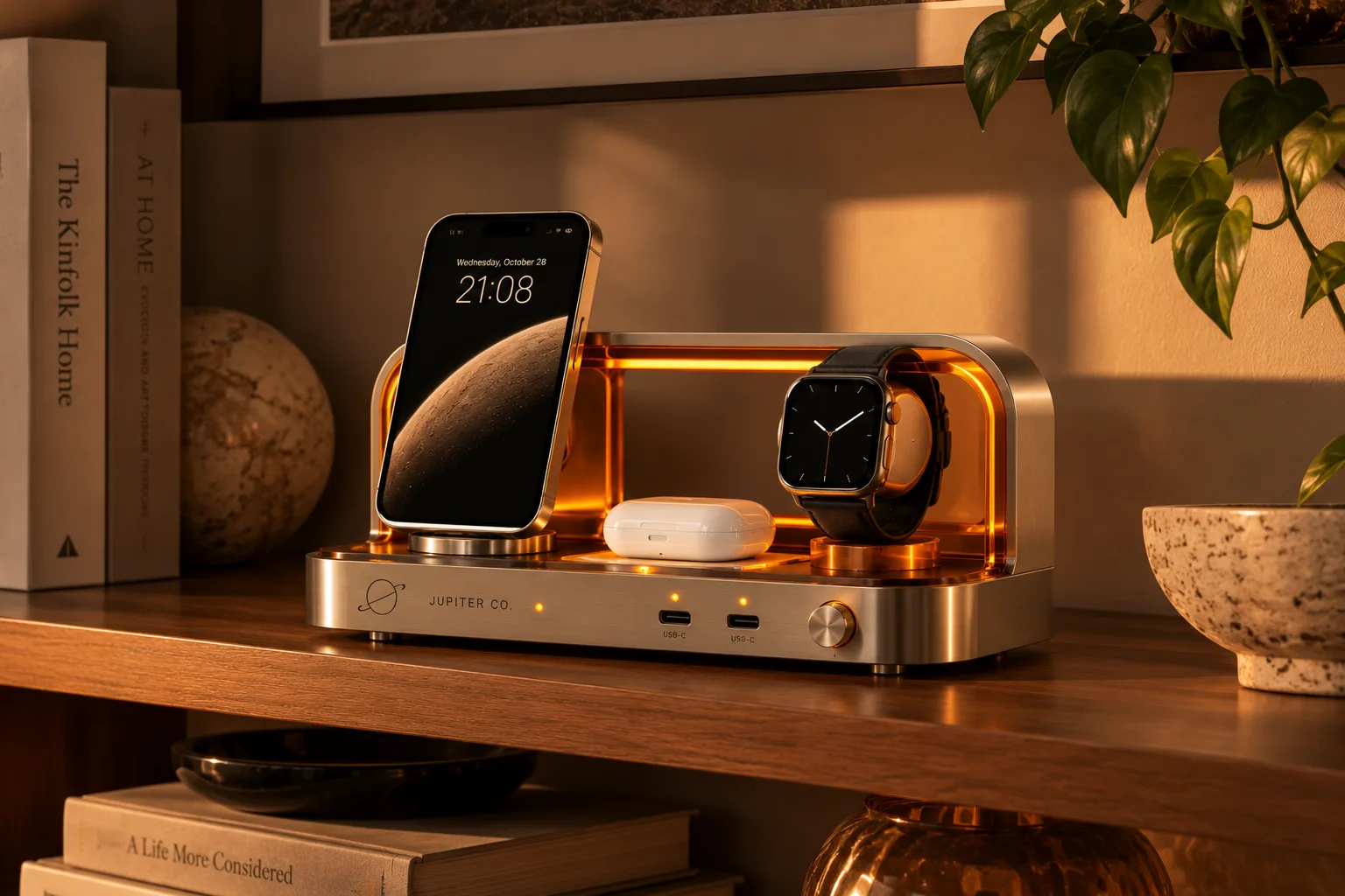
Dock charging station holding a phone, a watch and earbuds
Dock — phone, watch and earbuds in plain view
Macro of Flare's knurled steel dimmer dial and amber status pip
Hands first — a dial with real resistance
Macro of Signal's perforated steel grille
Material — brushed steel, no tricks
Macro of Count's flip digits
Show your work — state you can read at a glance
Selected artifacts — the brand world

Objects with somewhere to live. Every scene is a real room in warm light, with the product where it would actually sit.
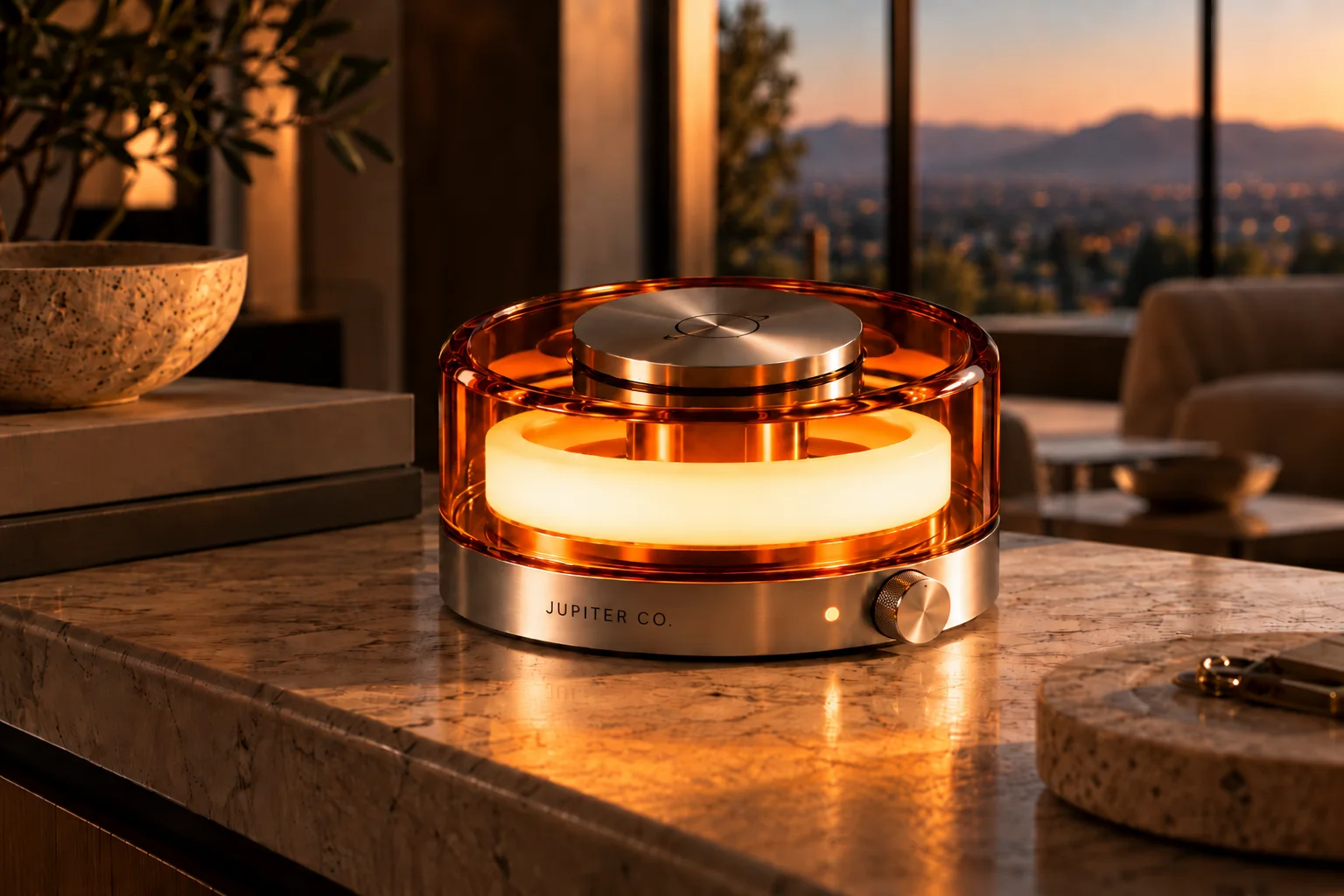
Flare glowing on a stone counter at dusk, with hills through the window
Architectural — Flare at golden hour
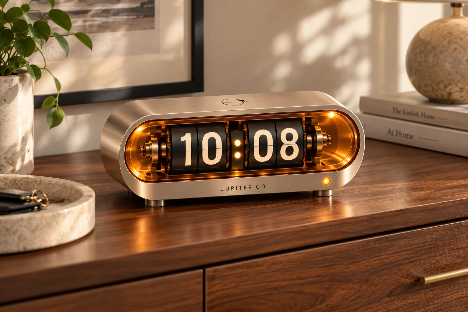
Count on a walnut dresser in afternoon light beside a stone tray and books
Daylight — Count on the dresser
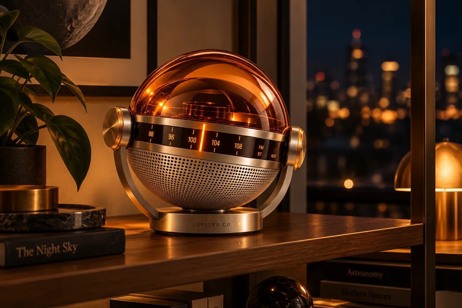
Signal on a bookshelf at night with city lights behind it
Evening — Signal on the shelf
Dock on a wooden shelf charging a phone, earbuds and a watch
In plain sight — Dock between the books
Selected artifacts — Deck 01 & 02, strategy and guidelines
Strategy deck cover: The future was supposed to be beautiful.
Cover — the brand idea
Slide: More capability. Less personality. Three category tensions
Category tension — disappearing, indirect, interchangeable
Slide: positioning map with Jupiter Co. alone in the physical controls, across the home quadrant
Positioning map — the open quadrant
Slide: one belief and three rules, In Plain Sight, Show Your Work, Hands First
Brand platform — one belief, three rules
Guidelines slide: logo library with full lockup, wordmark and symbol
Logo system — three expressions
Guidelines slide: six-color palette from Deep Space to Copper
Color — dark space, warm light
Guidelines slide: Hanken Grotesk, Michroma and IBM Plex Mono type system
Typography — one job per typeface
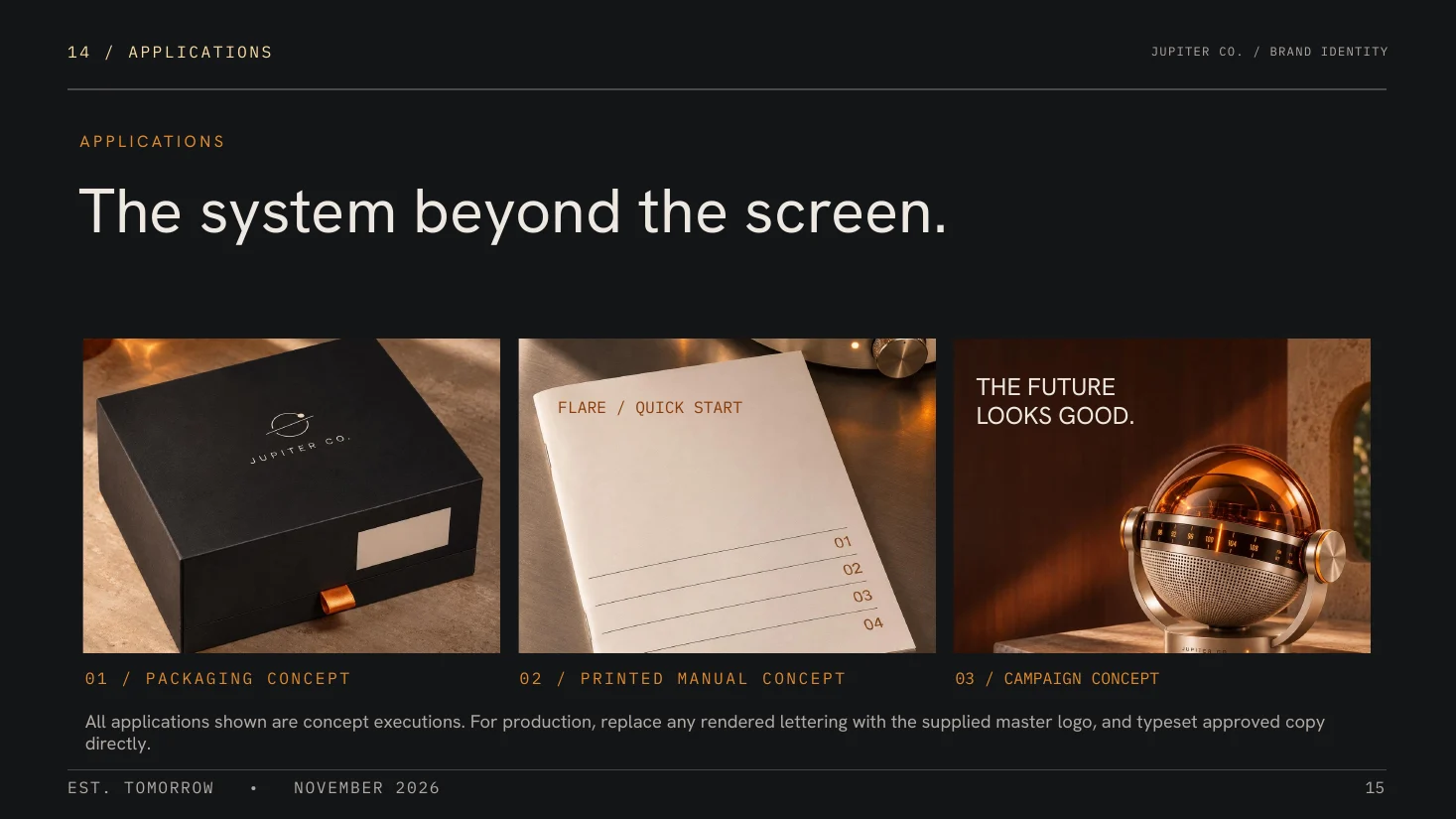
Guidelines slide: packaging, printed manual and campaign concepts
Applications — the system beyond the screen

What this demonstrates · Cohesive brand and product storytelling

A brand idea is only as strong as the rules that carry it. Jupiter starts from one category insight and follows it all the way through positioning, identity, naming, art direction and guardrails, to a site where the same voice holds up in product copy and long-form essays.

It's also how I approach brand work for hardware companies: find the tension the category has stopped noticing, make one clear choice about it, and write rules strict enough that every touchpoint, from a dial to a journal essay, follows it.

Jupiter Co. is an independent design concept, not a manufactured product line or launched electronics business. The objects, specifications and market positioning are illustrative, not commercially validated.

Explore brand strategy and identity services, read my leadership background, or start a conversation about brand creation or creative direction.

Project files — the full system
FAQ
Is Jupiter Co. a real company?+
No. It's an independent, self-initiated brand concept. The products, materials, specifications and prices are design concepts, and no primary customer research was conducted, so audience and category claims are hypotheses.
What did you create for Jupiter Co.?+
The full brand system: category analysis, audience mindsets, positioning, the brand platform and voice, visual identity and guidelines, art direction, product naming for a four-object collection, and a working brand site with product pages and three editorial essays.
Why four standalone objects with no app?+
The positioning depends on it. Smart-home brands already cover the home through apps. Jupiter's open space is physical control across light, sound, time and power, so every routine action has a dial, switch or light, and each object works on its own.
How do you use a Space Age reference without it becoming pastiche?+
With guardrails. The brand borrows the era's optimism, warm materials and confidence, and rules out the novelty props: no fins, portholes, rocket shapes or decorative sci-fi graphics. Every visual choice has to make the object easier to understand or nicer to live with.

DisclosureThe product renderings, images and website were AI-assisted.